The (Missing) Role of Design in Analytics

If you’ve spoken to me lately, follow me on Twitter, or have taken my order at Wendy’s, you probably know how much I hate traditional dashboards. My dad, a psychotherapist, has been working with me to get to the root of my upbringing that led to this deep-rooted feeling.
As it turns out, the cause of my feelings towards traditional dashboarding are actually quite obvious. Before entering the field of data, I spent my entire career as a product manager working alongside user experience designers and engineers on cross-functional product teams.
When building software, getting users to actually use the product is no easy feat. The smallest amount of friction can cause a user to abandon the flow. Add enough friction to any product and users and engagement will drop dramatically. As analysts, we know this intuitively. We are constantly measuring retention, cohorts, and engagement within our business.
These principles also apply to analytics. The more friction there is in analytics and the less we focus on the user, the less our output will be used. So it makes me wonder why, within the field of data, is design thinking often so absent?
Why are we lacking design thinking in analytics?
Painting with broad strokes, design is generally not something that is a top priority for data teams. There are a few primary reasons that I see off the top:
- Data teams think within the limitations of their current tools, not the ideal user experience.
- Traditional Dashboards have become so commoditized that there is a perception that anyone can build good ones.
- There is a belief that analytics ends at the data visualization, not the user experience.
- There is a general misconception that the overall look and feel does not matter in data analytics.
- Stakeholders often ask for a “dashboard” when they actually need something else (with more functionality).
These more or less boil down to data teams running like service teams rather than product teams—when you always give the squeakiest wheel the grease, it’s impossible to put in the strategic effort that design thinking requires.
One solution I proposed back in 2019 is hiring a data product manager, which seems to be picking up a bit of steam. But what would that person actually do?
I have attempted to sum the solutions to these complex issues into a table of overly-simplified do’s and don’ts:
| Don’t | Do |
| Think only within the constraints of your current tooling. | First define the ideal user experience, irrespective of tooling. |
| Think users can simply build their own solution given a self-service interface. | Recognize that hard ongoing problems require a design-focused analyst. |
| Stop at the data visualization. | Think about how to group visualizations, the interactions, and purpose-built exploratory flows. |
| Ignore look and feel. | Think about the overall aesthetics of your output. |
| Just respond to tickets and user requests. | Truly try to understand the problem and design the appropriate solution. |
The Full-Stack Analyst and Analytical Applications
An analyst who can gather the necessary data, transform it into the analytics-ready format, and understand & analyze it is an incredible asset to your team. An analyst who can also build a user experience around it is unstoppable.
If you think about the workflow for an analyst, a simple process might go something like this:
- Initial exploratory analysis and ad-hoc queries
- Model data in dbt
- Build out data visualizations
- Write tests/monitor performance
But, you might also consider adding the following to your workflow.
- Build user stories and use cases: Work with the end-user to understand exactly why they need the data and what decisions they need to make. Generally speaking, do not ask them to define the solution. That’s your job.
- Build out wireframes and user flows: A very quick sketch of the end-user experience can be shared for discussion. This might get some really great feedback about how the user may end up using the data.
- Build out the user interface: Break free from the traditional dashboard design and implement the design which truly solves the pain.
In order to realize the full potential of the "full stack analyst"”, we must apply the principles of design to be part of our workflows. We should shift our thinking from making traditional dashboards to building user-centric analytical applications.
This simple shift from thinking in “dashboards” towards thinking in “analytical applications” is one of the key changes which has helped me be more design-focused.
Here are a few examples:
| Traditional Dashboards | Analytical Applications |
| Built for generic use cases | Purpose-built for specific use cases |
| Standard dashboard interactions | Interactive based on the desired workflow |
| Fixed, static layout | Dynamic layout determined by logic |
| Each element is a tile | Elements can be grouped and purposefully-arranged |
| Filters are global | Users have preferences and their own defaults |
| Minimal software development lifecycle | Strong SDLC to promote user trust |
| Look and feel are ignored | Custom look and feel to match company products |
| Low bar for performance | High bar for performance |
An Example: Weather Applications
Let’s take a look at one of the OG analytical applications: the weather forecast.
Like most people, I rely on weather apps to make all sorts of decisions throughout the day. We are fortunate to have very smart and talented user experience designers working on these apps.
Here are a few examples from AccuWeather and the decisions it enables me to make:
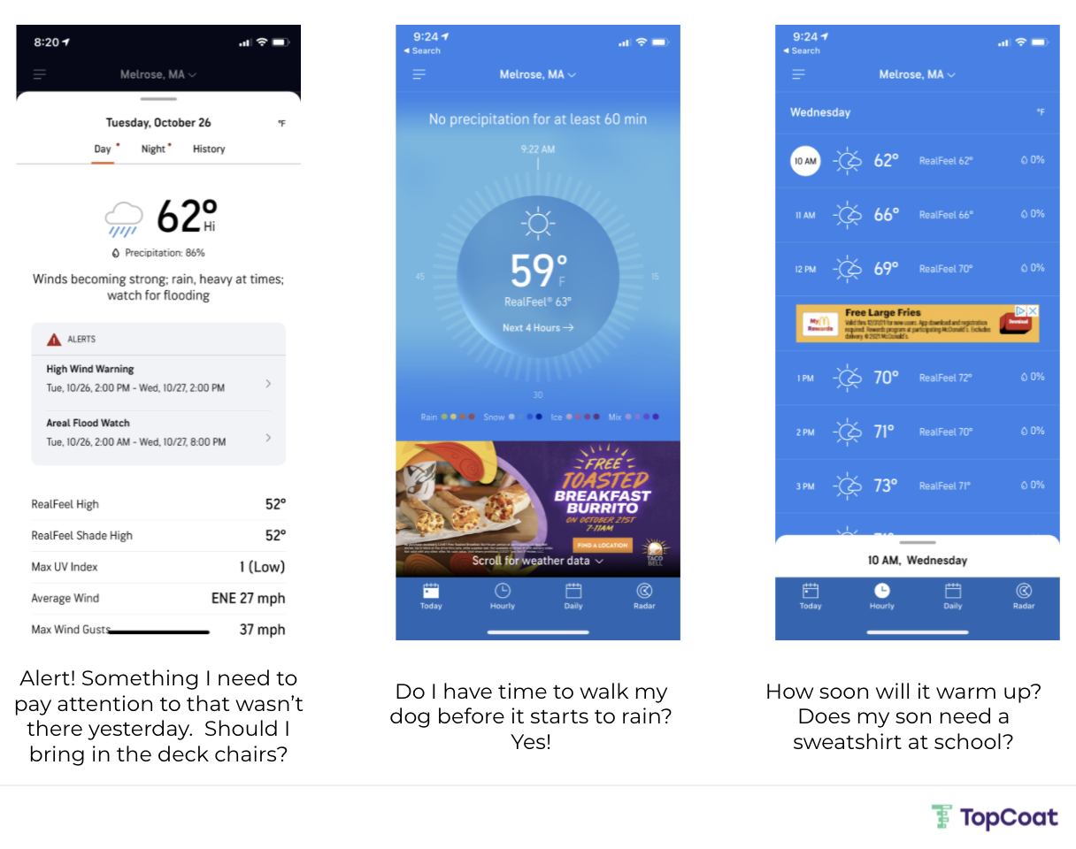
While the data being presented in the weather app could technically be presented in any dashboarding tool, the designers of this app agonized about every screen, interaction, and component to build a bespoke experience.
When it is done right, the user has everything they need to make quick decisions and take appropriate actions.
It’s worth noting this simple weather app is purpose-built for everyday weather situations. There are some use cases where highly specific information may be needed by a particular subset of users.
For example, surfers want different information. Ultimately, they may want an overall "Surf or don't surf" recommendation. Additionally, pilots could never simply rely on AccuWeather. These use cases warrant their own user-centered, purpose-built experiences.
The missing piece of the puzzle
While a design process can help you build better analytics output, there is still a missing part of the analytics stack to enable true user-centered design.
How would you, today, build out a weather-like application?
Traditional dashboarding tools limit the user experience and prevent purpose-built applications from being created. Luckily our tools are evolving to meet the needs of the data consumer.
I encourage you to explore these new tools as much as possible and to work design into your analytics workflows. I’m always up for chatting, especially about this - my DMs are always open on Twitter.
Comments